
When I write about errors in manuscripts, I usually focus on punctuation, spelling, and grammar because those are my favorite kinds of errors, meaning that I love correcting them. Literary agents, publishers, and readers notice these errors, and variations in type, and may lower their opinions of an article or book if they think there are too many.
However, you also need to pay attention to another class of errors that relate to the actual type: italic, bold, and other issues with the actual typography. Inappropriately designed typography will also catch the negative attention of people whose opinions matter to the future of your work.
The Roots of These Errors
Once upon a time, what was called hot metal typography produced all printed material. I’m not going into the technical details of how that worked. However, it was the only game around for centuries.
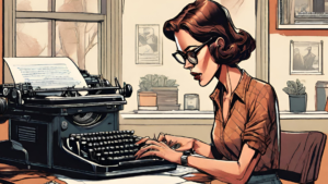
Then, in 1808, an Italian invented the typewriter. It didn’t get patented in the U.S. until the 1860s, and after that, it became increasingly used. I first learned to type on a typewriter, but I realize that some of you may have never used one.
Typewriters didn’t have bold or italic fonts. If you wanted to emphasize something, you underscored it. It was also traditional to put two space bars after a period. Like that.
The typography lacked the ability to use different sizes or different kinds of typefaces. It was very basic.
 In 1961, IBM invented the Selectric typewriter. Instead of individual keys striking the paper, a golf ball-shaped device moved around at the keys’ commands. It made for faster and more efficient typing. You could also take out one ball that typed what was called Roman type (now called regular—what you see here) and replace it with a ball that typed italic. Obviously, this took time, and you had to think about whether the italic was really necessary.
Sometime before 1970, IBM got more innovative and invented a typesetting machine. You could type on a cassette that stored your keystrokes, proofread, and revise it in a limited manner, and save it. This was the beginning of computerized typesetting, and it signaled the death of hot metal typography.
Typography for Everyone
The death of computerized typography as an industry followed not long afterwards, as it became possible on a home computer to see how the final copy would look when printed. It got easier to adjust spacing between paragraphs, design headings, and many other features.
That was the upside. The downside was that a lot of people with no background in even the basics of typographic design turned out some unattractive—and in some cases, unreadable—work.
Below, I describe some of the most common errors.
Choose Your Type
This recommendation applies primarily to those who are self-publishing or publishing a blog. A publishing company will usually have in-house or freelance designers to do the interior design.
The worst mistake I see in self-published work is the wrong typeface. Hundreds are out there. Some are called serif, in which this article is set. Others are sans-serif. Helvetica is a good example.
Here’s an enlarged serif typeface.
My Type
It has horizontal lines (serifs) at the bottoms of some of the letters. It also features varying thickness in the letter’s strokes. These features provide interest to the eyes that read them. Sans-serif letters induce boredom because of the sameness.
For this reason, you should choose a serif typeface for your book-length work. If a typeface is 12 points in height, this will be consistent, regardless of the typeface you choose. The width, however, will vary. This will affect how many pages your book will be. For an ebook version, this doesn’t matter, but if you want to keep printing costs down, you want a narrower typeface.
New Times Roman is one of those typefaces and a popular choice for many author-designers. As a result, it may get overdone.
I recommend duplicating a computer copy of your manuscript and using various typefaces for it. What looks attractive and is economical in terms of pages? You may want to get other opinions.
Use Italic and Bold Fonts Conservatively
Using a lot of italics is like using the word, “very,” too much. If you feel that you need to use that kind of emphasis, look at the word you’re italicizing. Can you replace it with a stronger one?
“She was very demanding.”
“She was a dictator.”
Sometimes italics are economical. I’d rather see someone write, “I told you” than “I told you,” she said in a menacing voice. The italics provide the menace.
Authors use italics to denote inner thoughts. I knew that w a mistake, she thought. I think this device can be used occasionally, but it rarely comes up in non-fiction. If it does, don’t overdo it.
You should use italics for book, and movie, and TV show titles, phrases in a foreign language. Grammarly provides a useful list for italicizing.
I firmly believe that all authors would greatly reduce their use of italic and bold if they had to stop and change that little golfball font each time they did.
Using bold type is even less appropriate in your manuscript except in titles and subtitles and as a word defined in a glossary.
Forget Double-spacing after a Period (Full Stop).
This practice became popular with the advent of the typewriter, but I’ve been unable to pinpoint its provenance.
Why shouldn’t you do this? Editors hate it. No more reasons needed.
!!!!!!
If you use more than this number of exclamation points in a book-length manuscript, an editor or proofreader will remove them. Be proactive. Don’t use them.
Pay attention to some of these basic points to make your type shine.
 Pat Iyer MSN RN LNCC is a consultant, speaker, author, editor and coach. She has written or edited over 60 of her own books and worked with a few dozen authors. Pat is an Amazon international #1 bestselling author. Coaches, consultants, and speakers hire Pat to help release the knowledge inside them so that they can attract their ideal clients.
She delights in assisting people to share their expertise by writing. Pat serves international and national experts as an editor, book coach, and a medical and business writer.